Information Graphics explain it all.
Information Graphics can do a lot of things. Their primary purpose is to explain complex concepts quickly through visual comparisons, either to other ideas, concepts or notions. Because they convey messages rapidly, they work well in advertisements and emails where readers generally don’t spend much time reading volumes of materials.
But they start with other objectives as well. Good ones are branded both visually and verbally. Good ones are flexible, meaning they work in several media like print, emails and social media posts. Good ones also represent different data points from different angles and leave the viewer with a better insight into data interpretation.
So why should you use them as part of your branded message?
1. They strengthen your visual brand message
2. People find it easy to understand and digest
3. Easy to share on social media
4. They’re fun to look at. Some might say engaging.
Below are examples of infographics we’ve completed for clients.
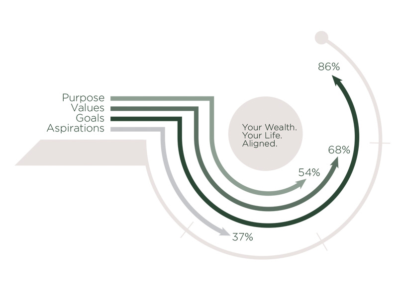
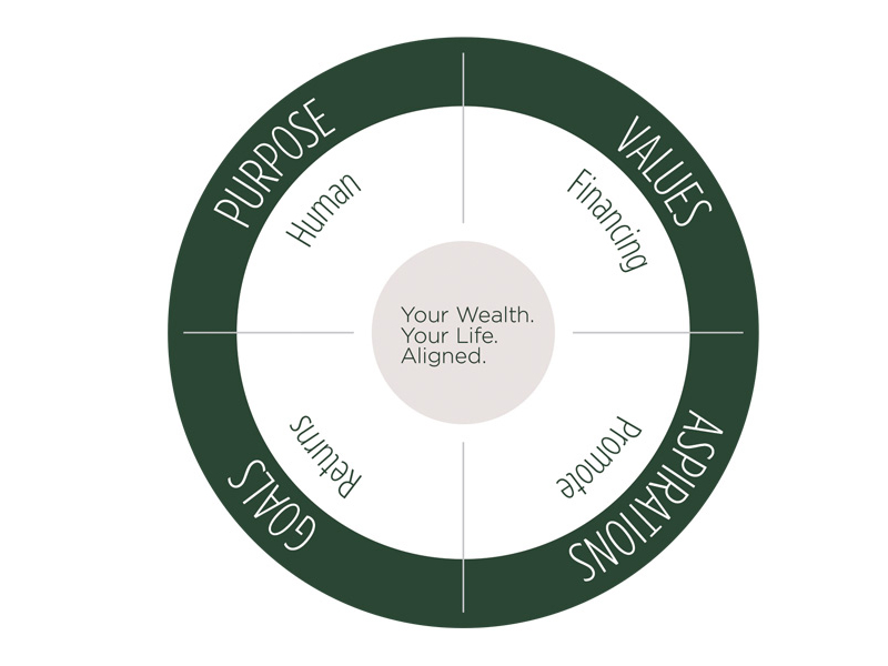
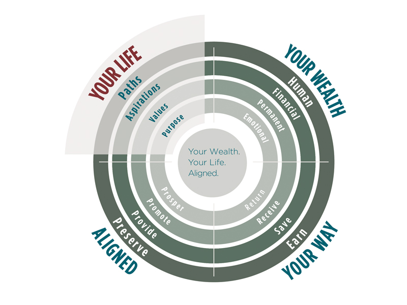
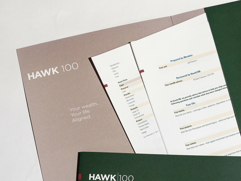
Hawk100 is an investment management service based on a member model. The number 100 is a count of potential clients which is limiting by design. Rick Clemens, Hawk 100 Proprietor, provides a concierge approach to wealth management.
Rick begins engagements by establishing a clear set of member’s investment objectives. These cover four significant investment goals and the distribution of the portfolio towards them. As his clientele is a manageable number, he hand creates quarterly statements and mails them.
We worked with Rick to not only develop his brand materials, both verbal and visual, but also the design of his quarterly statements. Rick uses our information graphics as a significant part of his visual brand.


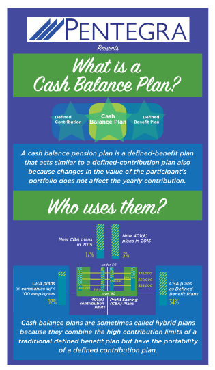
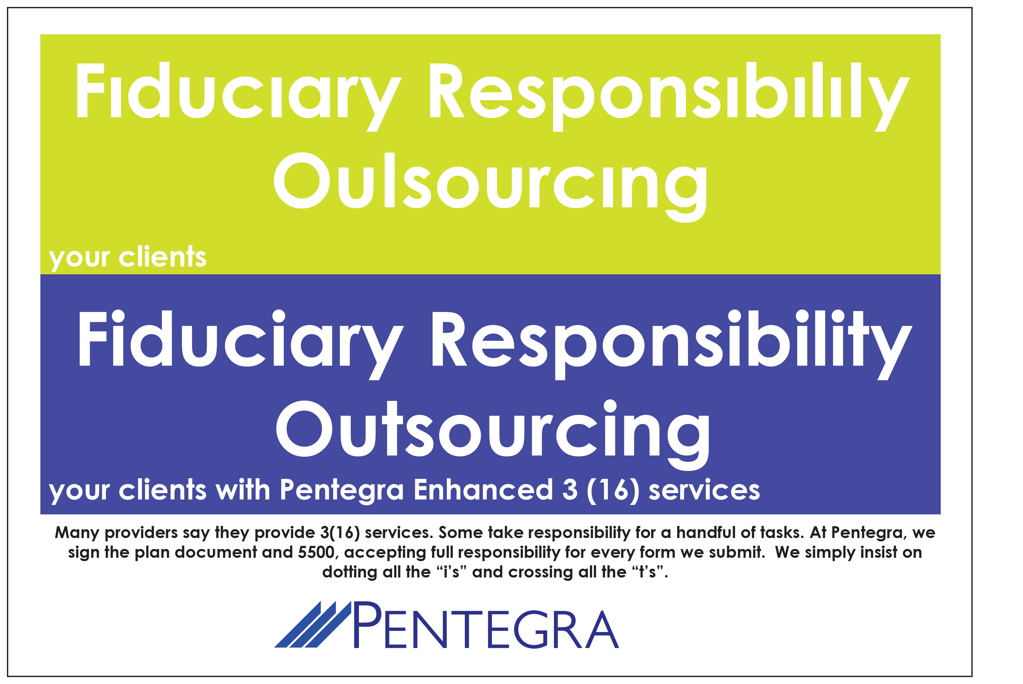
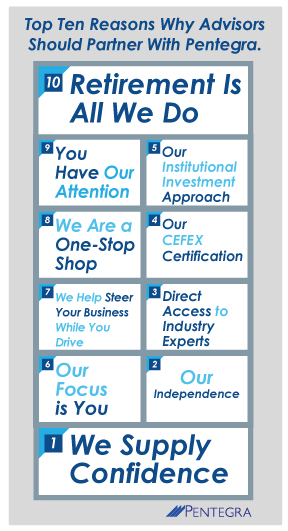
Pentegra needs the attention of their email audiences. The information on the products and services they offer financial advisors is complex. We worked with them to create a series of visualization tools in an innovative and branded manner.
Pentegra struggled with content marketing efforts and are generated little or no relevant traffic that will convert into investing customers. We created some tools which explained product attributes and features quickly. Pentegra used them in email blasts and as social media tools.
The series of Information Graphics presented here are designed to explain the main product attributes of the various financial products offered. The primary challenge is to make the top characteristics visible and understandable at first glance while branding applying clear branding elements.
The next challenge was to use them in email blasts and social media applications.